NTV
NTV is a leading boutique editing studio working on projects like Beyoncé's Black
Is King and Jay Rock's East Side.
Is King and Jay Rock's East Side.
BRANDING
ART DIRECTION
BRAND STRATEGY
ILLUSTRATION

The Ask
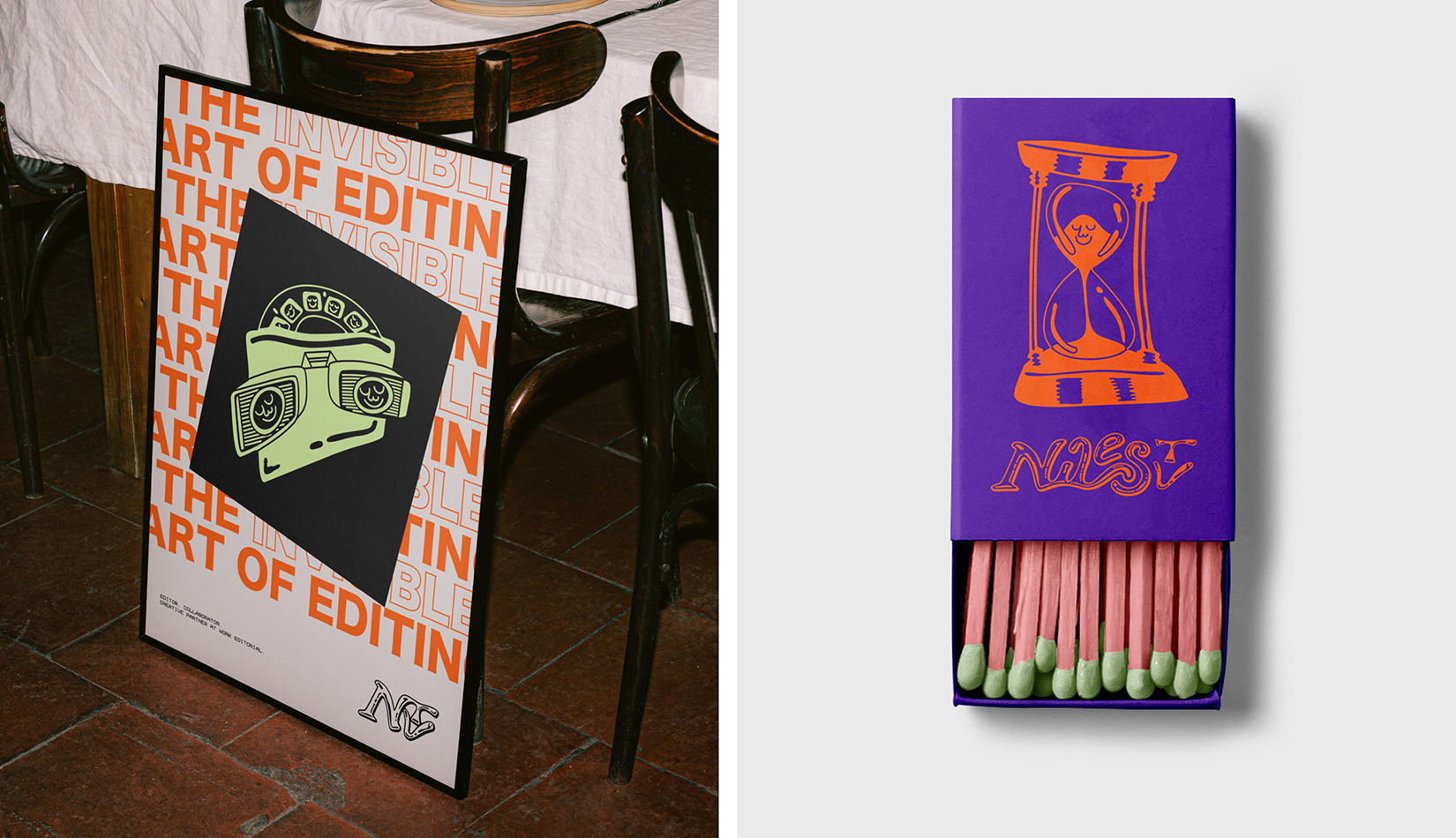
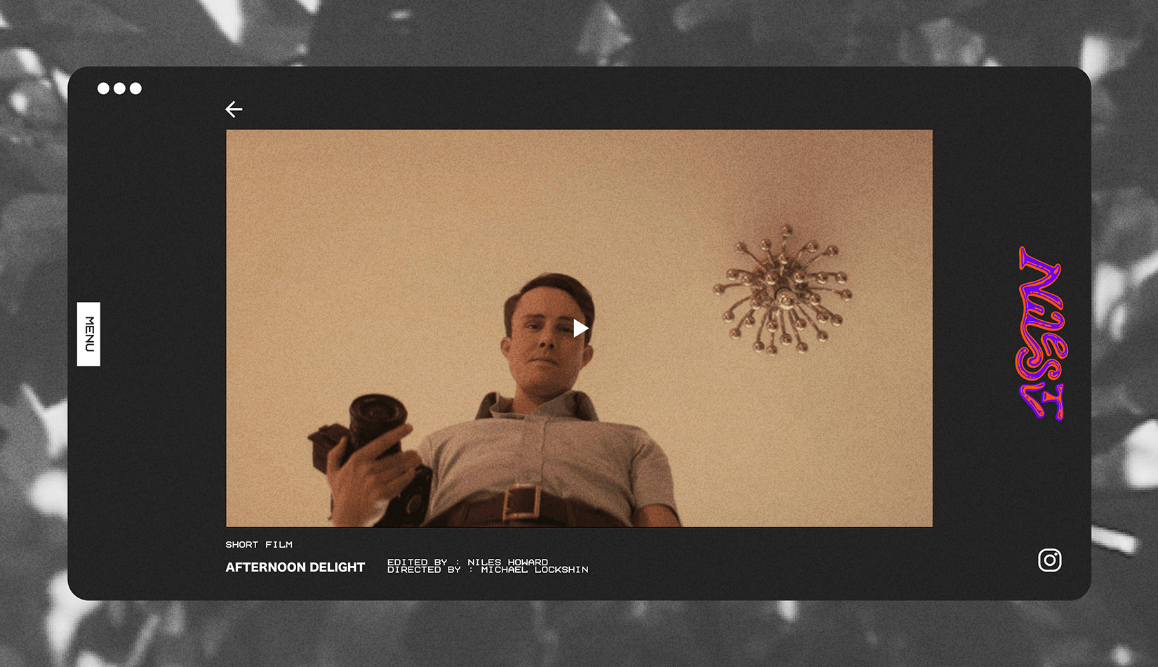
My client wanted to develop new branding that reflected his love for old-school jazz posters, vintage animation title cards, and the nostalgic VHS aesthetic of his childhood—the very elements that inspired his path into the film industry.
My client wanted to develop new branding that reflected his love for old-school jazz posters, vintage animation title cards, and the nostalgic VHS aesthetic of his childhood—the very elements that inspired his path into the film industry.
My Role: Project Lead, Designer, Illustrator
The Strategy
I spent extensive time with my client discussing the rich history of cinema, the evolving art of the movie poster, and his personal creative philosophy, which we came to describe as 'the invisible art of editing.' These conversations revealed how deeply he values the subtle, often overlooked decisions that shape a film’s emotional rhythm and visual storytelling. By understanding his perspective, I was able to create a brand that not only honors his influences but also communicates the quiet craftsmanship at the heart of his work.
I spent extensive time with my client discussing the rich history of cinema, the evolving art of the movie poster, and his personal creative philosophy, which we came to describe as 'the invisible art of editing.' These conversations revealed how deeply he values the subtle, often overlooked decisions that shape a film’s emotional rhythm and visual storytelling. By understanding his perspective, I was able to create a brand that not only honors his influences but also communicates the quiet craftsmanship at the heart of his work.
The Outcome
Drawing from all of this inspiration, we designed a fluid, adaptable logo along with a distinctive typographic and visual system that complemented his work without overshadowing it. The goal was to create a brand identity that elevated his portfolio while letting each piece speak for itself. I also developed a practical, easy-to-use design system that he could confidently implement on his own—ensuring consistency across platforms while giving him creative flexibility.
Drawing from all of this inspiration, we designed a fluid, adaptable logo along with a distinctive typographic and visual system that complemented his work without overshadowing it. The goal was to create a brand identity that elevated his portfolio while letting each piece speak for itself. I also developed a practical, easy-to-use design system that he could confidently implement on his own—ensuring consistency across platforms while giving him creative flexibility.